


General
Real-Time Visibility Across In-House and 3PL Fleets: What Breaks in Multi-Country Operations in 2026

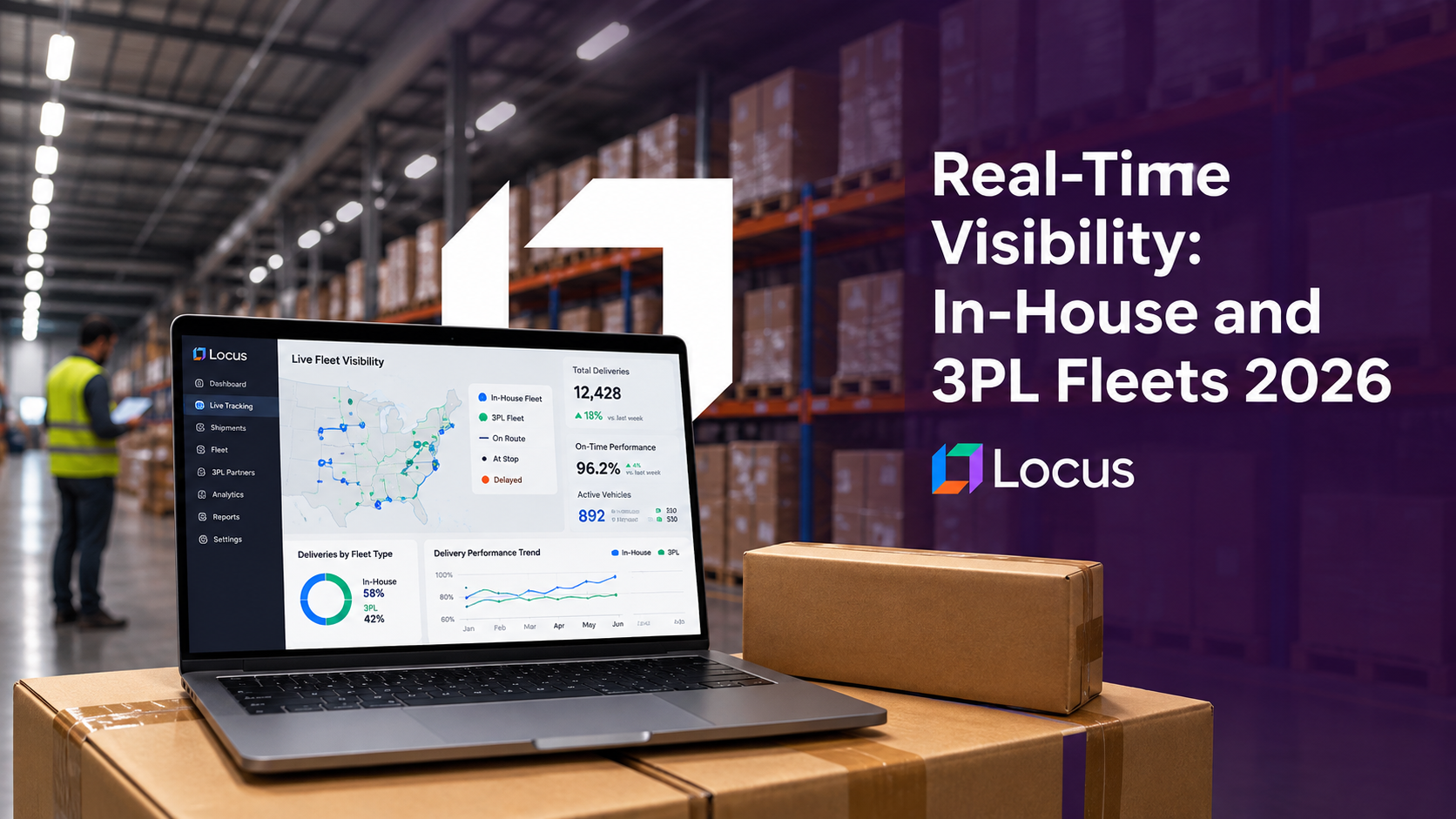
Real-time visibility across a mixed fleet means holding position and status for shipments moving on vehicles you operate and on vehicles you contract, in one operational view. The difficulty is not integration. It is that an owned vehicle reports continuously while a contracted carrier reports at milestones, so the two feeds are different measuring instruments, and a dashboard that displays them identically will systematically misreport where problems are. Locus, the world’s first Decision-Intelligent, Agentic TMS, normalizes both into one event model with an explicit freshness attribute across 30+ countries and more than 1,000 carriers.
Key Takeaways
- An owned fleet reporting GPS every minute and a contracted carrier reporting at milestones are different instruments. Displaying both as one status list compares performance using two different sampling rates.
- In our illustrative model, 99.8% of delays on a continuously tracked vehicle are visible before delivery, against 50% on a carrier reporting every four hours and effectively none on a carrier reporting every eight.
- The bias runs opposite to the common assumption. In a 50/50 mixed fleet with identical true delay rates, roughly two thirds of visible delays are attributed to the owned fleet, because the owned fleet is the part you can see.
- Country comparisons inherit the distortion. Three countries with an identical 10% true delay rate report 9.0%, 7.5% and 2.0% purely from differences in fleet mix and carrier reporting cadence.
- Locus normalizes owned-fleet telemetry and carrier events into one model with freshness carried as data, so an absence of alerts can be distinguished from an absence of information.
Why Mixed-Fleet Visibility Is a Different Problem at Enterprise Scale
Almost no large shipper runs one kind of capacity anymore. AlixPartners’ 2026 Home Delivery Survey found more than 90% of executives run a mix of last-mile carriers and 32% use four or more, and that mix usually sits alongside an owned or dedicated fleet rather than replacing it. The result is a network where the same customer promise is served by vehicles under direct instrumentation and vehicles under contractual reporting, often on the same day in the same city.
The cost of not seeing it accurately scales with the same trend. McKinsey’s out-of-home delivery work puts the last mile at 60% to 70% of total parcel delivery cost, and ATRI’s 2026 operational cost report put marginal operating cost at $2.336 per mile in 2025. Recovery actions taken late cost more than recovery actions taken early, and how late an action can be taken is set by how quickly the problem became visible.
Conditions are also getting harder to predict from history. INRIX’s 2025 Global Traffic Scorecard found congestion increased in 254 of the 290 US cities it analyzed, with drivers in Chicago losing 112 hours. Networks that once absorbed variance in planned slack increasingly need to detect and respond instead, which puts weight on detection speed rather than on plan quality alone.
The enterprise version of this problem has a further dimension that single-country operations never encounter. Carrier mix varies by country, reporting standards vary by carrier, and the fleet-to-carrier ratio varies with how mature each market is. A global dashboard applies one definition of “at risk” to all of it, which is where the reporting starts to mislead.
Why One Dashboard Is Really Three Instruments
A delay does not become visible when it happens. It becomes visible at the next position update. That single fact governs everything else, because the interval between updates differs by two orders of magnitude between an owned vehicle and a contracted carrier.
We modeled it directly. The inputs are illustrative rather than measured: a disruption occurs at a random point during transit, roughly four hours of transit remain after it, and it becomes visible at the next position update, so expected detection lag is half the update interval.
| Feed type | Update interval | Expected detection lag | Share of delays visible before delivery |
|---|---|---|---|
| Owned fleet, GPS telemetry | 1 minute | Under 1 minute | 99.8% |
| Owned fleet, 5-minute telemetry | 5 minutes | 2 minutes | 99.0% |
| Contracted carrier, frequent milestones | 2 hours | 60 minutes | 75.0% |
| Contracted carrier, standard milestones | 4 hours | 2 hours | 50.0% |
| Contracted carrier, sparse milestones | 8 hours | 4 hours | Effectively none |
The bottom row is the one that changes how you should read a dashboard. On a carrier reporting every eight hours, a delay arising mid-leg is typically not visible at all before the delivery either succeeds or fails. It is not that the alert arrives late. There is no alert, and the shipment sits in the “no known issues” bucket until the outcome is recorded.
This is why a unified view built on raw feeds is not one instrument. It is a continuous sensor, a slow sampler, and in the worst case a post-hoc recorder, drawn on one screen in one color scheme.
The Bias Runs Opposite to the Common Assumption
The intuitive conclusion from the table above is that a mixed dashboard understates 3PL problems, and it does. What is less intuitive is what that does to the comparison between your own fleet and your carriers.
Take a network split evenly by volume between an owned fleet on continuous telemetry and carriers reporting every four hours, with an identical true delay rate on both. Of the delays that are visible at any moment, roughly 67% sit on the owned fleet and 33% on the carriers, because the owned half is almost fully observed and the contracted half is about half observed. The true split is 50/50.
The practical consequence is that a mixed-fleet control tower tends to over-attribute problems to the fleet you operate directly, which is the opposite of what most teams expect walking into the data. Owned fleet performance gets scrutinized because it is legible. Carrier performance looks calmer than it is, and the calm is a reporting artifact rather than a result.
That has real consequences for decisions. Insourcing and outsourcing cases get built on these comparisons. So do carrier scorecards, route-to-mode decisions and the allocation of operational attention on a bad day. A comparison between a continuously observed fleet and a sampled one is not a performance comparison at all until the sampling difference is corrected for.
What This Does to Country Comparisons
Multi-country operations inherit the distortion and then amplify it, because the two variables that drive it, fleet mix and carrier reporting cadence, both vary by market.
Consider three countries with an identical true delay rate of 10%. The first runs 80% owned fleet with carriers reporting every four hours. The second is an even split on the same carrier cadence. The third runs 20% owned fleet with carriers reporting every eight hours, which is common in markets served through longer subcontracting chains.
| Market | Owned fleet share | Carrier update interval | True delay rate | Reported delay rate |
|---|---|---|---|---|
| Country A | 80% | 4 hours | 10% | 9.0% |
| Country B | 50% | 4 hours | 10% | 7.5% |
| Country C | 20% | 8 hours | 10% | 2.0% |
Country C reports a delay rate four and a half times better than Country A while performing identically. It is not the best-run market in the network. It is the darkest one, and on a leaderboard sorted by reported exceptions it would be held up as the example the others should follow.
This is the specific failure mode of a global visibility rollout that succeeds technically. Every country is connected, every shipment appears, and the resulting league table ranks markets by how much instrumentation they have rather than by how well they run. The correction is not more integration. It is carrying the measurement conditions alongside the measurement, so a 2% figure computed from sparse data is never placed next to a 9% figure computed from dense data without the difference being visible.
In practice that means two changes to how the numbers are published. Report an observation density alongside every market figure, whether that is average update interval, owned-fleet share or the share of transit time under active observation, so the reader can see what the number was computed from. Then compare markets within feed class before comparing them overall, because an owned fleet in one country and an owned fleet in another are measured the same way and are genuinely comparable, while the blended figures are not.
How a Unified Mixed-Fleet Visibility Layer Has to Work
1. Normalize both feeds into one state model
Owned-fleet telemetry and carrier milestone events must resolve to the same set of shipment states, so that “in transit” means the same thing whichever vehicle is carrying it. Without this, every downstream metric is computed over a mixed vocabulary.
2. Carry freshness as data, not as a display detail
Every state needs an attached observation time and update interval. This is what allows a system to distinguish “verified moving normally 40 seconds ago” from “no information for six hours”, which are the same green status on most dashboards and completely different operational facts.
3. Rank by risk, adjusted for darkness
Exception queues sorted by known delay will always surface the best-instrumented shipments first. A queue that also weights time since last observation surfaces the shipments that are unobserved and overdue, which is where the undetected failures concentrate.
4. Compute performance metrics within comparable cohorts
On-time and exception rates should be reported per feed class before they are aggregated, and country comparisons should state the observation conditions. Aggregate first and the composition difference disappears into a single number that reads as performance.
5. Close the loop into execution rather than reporting
Detection only pays when it changes what happens next. The exception needs to trigger a re-plan, a customer communication or a carrier escalation automatically, because a faster alert that lands in the same manual queue produces the same outcome slightly earlier.
6. Make reporting cadence a contractual term, not a discovery
Update frequency is the single variable that governs detection on contracted capacity, and it is negotiable at renewal in a way that platform capability is not. Carriers that cannot improve cadence can often be moved to lanes where transit is short enough that sparse reporting still leaves room to act, which turns a data limitation into a routing decision.
What to Check on Your Own Visibility Stack
These five checks run against data you already hold, and each one is answerable in a morning.
Check 1: Pull time since last update by feed class, as a distribution rather than an average. Averages hide the tail, and the tail is the risk. What matters is the 90th percentile gap on your sparsest carrier, because that number is the length of time a problem can exist without anyone knowing.
Check 2: Compare exception rates between owned and contracted capacity, then ask whether the gap survives correction. Divide each exception rate by the share of delays that feed class could plausibly have surfaced. If the difference between your fleet and your carriers narrows sharply, the original comparison was measuring observation density.
Check 3: Establish what green means on your sparsest feed. Pick a carrier with long milestone gaps and ask what status a shipment holds two hours into an unreported breakdown. On most stacks the answer is the same status it held when everything was fine, and that is the defect worth fixing first.
Check 4: Correlate your country league table against instrumentation density. Plot reported exception rate against owned-fleet share or average update frequency per market. A strong relationship means the table is partly ranking visibility rather than performance, and the best-performing market may be the least observed.
Check 5: Time one real exception end to end. Record when the disruption occurred, when it became visible in your system, and when someone acted. The gap between the first two is a data property you can engineer. The gap between the second and third is a workflow property, and teams usually discover the second gap is the larger one.
Running these before a platform evaluation changes what you ask vendors for. Most visibility procurement optimizes for carrier count and integration speed, which are the easy questions, when the binding constraint is usually detection latency on the carriers you already have connected.
Mixed-Fleet Visibility in Action
A Canadian grocery brand delivering fresh and perishable orders to homes in more than 30 cities through contracted third-party fleets faced exactly this structure: the promise was the retailer’s, the vehicles were not. The carrier orchestration deployment produced 33% faster deliveries, 15% lower fulfillment cost and customer support resolution 10 to 20 times faster. The support figure is the visibility figure in disguise, because resolution time is bounded by how quickly the operation knows what happened.
A leading North American retailer running multi-hundred stores across ocean, rail and road consolidated six legacy systems into one planning and execution layer. The multimodal automation deployment reached 99% or better on-time delivery with exceptions resolved in under two hours, 95% or better route compliance and more than $1M in savings with break-even inside the first year. Exceptions resolved in under two hours is only meaningful because the same layer defines when the exception clock starts, across modes that report at very different rates.
The pattern in both is that the visibility gain came from consolidation rather than from adding feeds. Neither operation had a coverage problem in the sense of shipments nobody could see. Both had a comparability problem, where the same event meant different things depending on which system recorded it, and the resolution times improved once one layer defined the vocabulary.
Common Mistakes in Mixed-Fleet Visibility Programs
Treating integration completeness as visibility. Every carrier connected and every shipment displayed is a coverage achievement, not a detection one. What matters is how long a problem stays invisible after it occurs.
Comparing owned-fleet and carrier performance on raw exception counts. The owned fleet is observed far more densely, so it will show more known problems at identical true performance.
Ranking countries on reported exception rates. Markets differ in fleet mix and carrier cadence, so the league table partly measures instrumentation. The best-looking market is often the least observed.
Reading green as good. On a sparse feed, green means nothing has been reported recently, which is also what a serious problem looks like until the next scan.
How Locus Approaches Mixed-Fleet Visibility
Locus, the world’s first Decision-Intelligent, Agentic TMS, treats owned-fleet telemetry and contracted-carrier events as inputs to one state model rather than as two systems shown side by side. ShipFlex provides pre-integrated access to carriers within an ecosystem of more than 1,000, so carrier events arrive already mapped to a common vocabulary instead of being reconciled per integration, and the Control Tower presents the resulting view across every vehicle, carrier and active order. Because the same platform also holds the plan, an exception can be routed into a re-plan rather than into a queue.
The governance layer matters here more than it does in a single-fleet deployment. Locus carries Explainability and Traceability as platform mechanisms, which is what lets an operator see why a shipment was flagged and on what observation, and Autonomy Levels determine which exceptions are handled automatically and which wait for a human. In a mixed fleet those controls are what make automated action safe on data of uneven quality, because the system knows how good its own information is.
Locus has been recognized by Gartner for seven consecutive years across multiple research categories, including the 2026 Gartner Hype Cycle for AI-powered logistics and the 2026 Gartner Market Guide for Multicarrier Parcel Management Solutions, where ShipFlex is featured as a Representative Vendor. QKS Group positions Locus as a Leader in its SPARK Matrix for Transportation Management Systems, and Locus holds the number one position on G2 for Route Planning software. The platform has run more than 1.5 billion deliveries for 360+ enterprise customers across 30+ countries at 99.99% uptime.
In October 2025, Ingka Investments, the investment arm of Ingka Group, the world’s largest IKEA retailer, acquired Locus. Locus continues to operate independently.
The question a multi-country enterprise should ask of any visibility platform is not how many carriers it connects but whether it knows how fresh each answer is. A platform that carries observation conditions alongside observations can tell you that a market is quiet because it is performing and not because it is dark, and it can rank an exception queue by where the undetected failures actually are. Locus normalizes owned and contracted feeds into one model with freshness carried as data, across 30+ countries and 1,000+ carriers, inside the system that also holds the plan. Schedule a demo to see mixed-fleet visibility against a live network.
Frequently Asked Questions
How do you get real-time visibility across both in-house and 3PL fleets? By normalizing owned-fleet telemetry and carrier milestone events into one shipment state model, with observation time and update interval carried as data on every state. Integration alone puts both on one screen; normalization plus freshness is what makes the two comparable, because an owned vehicle reports continuously and a contracted carrier reports at milestones.
Why do 3PL shipments show fewer exceptions than owned-fleet shipments? Usually because they are observed less often rather than because they perform better. In our illustrative model, 99.8% of delays on a continuously tracked vehicle become visible before delivery, against 50% on a carrier reporting every four hours, so a dashboard showing both will surface far more owned-fleet problems at identical true performance.
Can you compare delivery performance across countries on one visibility dashboard? Not from raw exception rates, because fleet mix and carrier reporting cadence vary by market. Three countries with an identical 10% true delay rate report 9.0%, 7.5% and 2.0% in our model purely from those differences, so country comparisons need the observation conditions reported alongside the figures.
What is the difference between visibility coverage and detection speed? Coverage is the share of shipments for which you hold usable data. Detection speed is how long a problem stays invisible after it occurs. A network can have high coverage and slow detection at the same time, and it is detection speed that determines whether recovery is still possible.
What should a multi-country enterprise look for in a real-time visibility platform? Normalization into one state model, freshness carried as data rather than shown as a timestamp, exception ranking that accounts for unobserved shipments, per-cohort metrics before aggregation, and a path from exception to automated action. Carrier count matters far less than whether the platform knows the quality of its own information.
Does more frequent carrier tracking data solve the problem? It narrows the gap without closing it, because carrier feeds remain event-based while owned telemetry is continuous. The durable fix is to treat the difference as a known property of the data and correct for it in metrics and alerting, rather than to assume parity once every carrier is connected.


General
Locus vs Onfleet vs FarEye: Delivery Slot Promising at Checkout in 2026

Sep 17, 2026
How Locus, Onfleet and FarEye each compute the delivery date shown at checkout, compared on what every vendor publishes about its own capacity model.
Read more
General
How to Choose a Route Planner: Match the Tool to Your Binding Constraint in 2026

Sep 17, 2026
Route planners are usually chosen by fleet size. The variable that actually decides which class of tool you need is how tight your binding constraint is.
Read moreInsights Worth Your Time


















Real-Time Visibility Across In-House and 3PL Fleets: What Breaks in Multi-Country Operations in 2026